


CSS3 Transition
Next ❯CSS3 Animation
Used to show smooth transition
- turned_in_notTransition related properties
- transition-property
- transition-duration
- transition-timing-function
- transition-delay
- transition
*Mouse over me to check the difference
Without
transition
With
transition
Mouse Over
me!
Here, only width property will be affected by transition not height
#box {
background-color: #ef5195;
width:170px;
height: 80px;
transition-property:width;
transition-duration: 2s;
transition-timing-function: ease;
transition-delay: 0s;
}
#box:hover {
width:200px;
height:110px;
}transition propertiessubject
- label_outlineTryout Others
Once you change any value below, check the output, Just mouse over on the box
Properties Values transition-property:transition-duration:transition-timing-function:transition-delay:
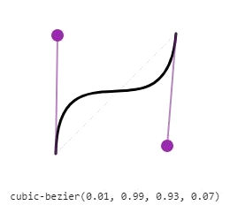
cubic-bezier( )
To customize the transition-timing-function as per your own requirement, also called as speed curve
Syntax
cubic-bezier(x1, y1, x2, y2)x : Float values between 0 to 1 (0 >= x <= 1), defines 'time'
y : Float values between 0 to 1 preferred, but can have negative values (y<0 or y>=0), defines 'progress'
- Note! Try not to go too high float values when setting y1, y2 until required
Below image is showing one of the speed curve, of value specified
Mouse Over
me!
#box1 {
background-color: #ef5195;
width:170px;
height: 80px;
/*transition:property duration time-function delay;*/
transition:transform 2s ease 0s;
}
#box1:hover {
transform:rotate(180deg);
}transition (All-In-One)subject
- label_outlineMultiple transition
/*transition:transition1,transition2,.....,transitionN;*/ transition:width 2s ease 0s,height 3s linear 1s;/*For all properties*/ transition:2s; /* OR */ transition:2s linear 1s;
❮ Prev 3D Transform
Next ❯CSS3 Animation


 So,
So,