


CSS3 Border Radius
Next ❯Border Image
Used to round the corners of the border of an element
- It's a part of border property
- turned_in_notBorder Radius Properties
- border-top-left-radius
- border-top-right-radius
- border-bottom-left-radius
- border-bottom-right-radius
- border-radius
border-radiusis declared separately
Simple
border-radius as 4 part controls (1 control for each corner)
Checkout the Border Radius
h5 {
border: 4px solid #af71d5;
border-top-right-radius: 8px;
}border-radiussubject
border-radiusclose
<!DOCTYPE html>
<html>
<head>
<title>Full CSS Code</title>
<style>
h5 {
border: 4px solid #af71d5;
border-top-right-radius: 8px;
}
</style>
</head>
<body>
<h5>Checkout the Border Radius</h5>
</body>
</html>- label_outlineTryout Others
Properties Values border-top-left-radius:border-top-right-radius:border-bottom-left-radius:border-bottom-right-radius:
Checkout the Border Radius
h5 {
border:6px solid #71d5ae;
/*border-radius:top-left top-right bottom-right bottom-left*/
border-radius:1px 15px 12px 30px;
}border-radius (All-In-One)subject
border-radius (All-In-One)close
<!DOCTYPE html>
<html>
<head>
<title>Full CSS Code</title>
<style>
h5 {
border:4px solid #71d5ae;
/*border-radius:top-left top-right bottom-right bottom-left*/
border-radius:1px 15px 12px 30px;
}
</style>
</head>
<body>
<h5 style="text-align: center;">Checkout the Border Radius</h5>
</body>
</html>- label_outlineOther ways to write
>h5 { /*border-radius:top-left top-right bottom-right bottom-left*/ border-radius:1px 15px 12px 30px; }h5 { /*border-radius:top-left top-right&bottom-left bottom-right*/ border-radius:1px 15px 12px; }h5 { /*border-radius:top-left&bottom-right top-right&bottom-left */ border-radius:1px 15px; }h5 { /*border-radius:all sides*/ border-radius:10px; }
Advance
Basically, border-radius is divided into 8 part controls (2 controls for each corner)
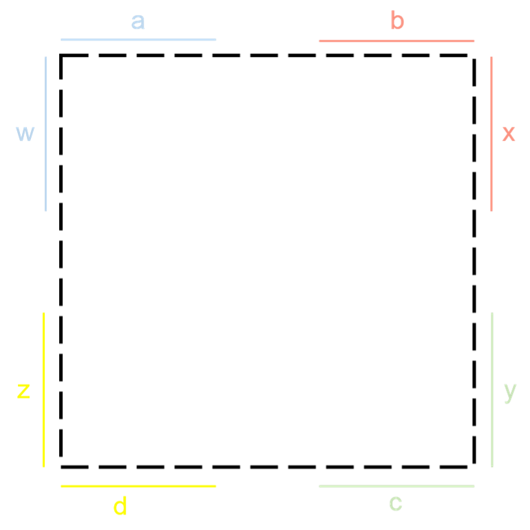
Syntax
border-radius:a b c d / w x y z;
/*Individually*/
border-top-left-radius: a w;
border-top-right-radius: b x;
border-bottom-right-radius: c y;
border-bottom-left-radius: d z;
a
b
c
d
w
x
y
z
border-radius: 85% 5% 40% 25% / 60% 0% 60% 40%;
div {
height: 300px;
width: 300px;
border:2px solid black;
border-radius:85% 5% 40% 25% / 60% 0% 60% 40%;
background: radial-gradient(circle,#8ff6d5,#5cdaf5);
}border-radiussubject
border-radiusclose
<!DOCTYPE html>
<html>
<head>
<title>Full CSS Code</title>
<style>
div {
height: 300px;
width: 300px;
display: block;
margin: auto;
border:2px solid black;
border-radius:85% 5% 40% 25% / 60% 0% 60% 40%;
background: radial-gradient(circle,#8ff6d5,#5cdaf5);
}
</style>
</head>
<body>
<div></div>
</body>
</html>❮ Prev CSS3 Gradient
Next ❯Border Image


 So,
So,