


CSS3 Flexbox
Next ❯User Interface
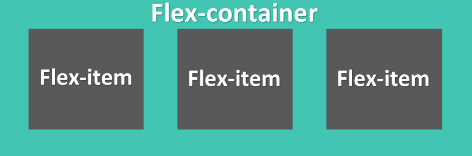
It is a new layout mode in CSS3
- It contains flex container[Parent] and flex items[child]
- flex container is declared either by
display:flexordisplay:inline-flex - flex items are declared inside flex container
- turned_in_notFlexbox related properties
- labelParent Properties
- flex-direction
- flex-wrap
- flex-flow
- justify-content
- align-items
- align-content
- labelChild Properties
- order
- flex-grow
- flex-shrink
- flex-basis
- flex
- align-self
Parent Properties
It's used to set the default structure for your flex-items
1
2
3
flex-direction: |
.flex-container {
display: flex;
flex-direction: column;
width: 200px;
}flex-directionsubject
flex-directionclose
<!DOCTYPE html>
<html>
<head>
<title>Full CSS Code</title>
<style type="text/css">
.flex-container {
display:flex;
flex-direction: column;
margin:auto;
width: 200px;
background-color: #42c6b3;
}
.flex-container div{
background-color: #3e3737;
margin: 5px;
width:60px;
text-align: center;
line-height: 40px;
font-size: 20px;
color: white;
}
</style>
</head>
<body>
<div class="flex-container">
<div>1</div>
<div>2</div>
<div>3</div>
</div>
</body>
</html>1a
2a
3a
4a
5a
6a
nowrap value is used to show all items in single line
flex-wrap: |
.flex-container {
display: flex;
flex-wrap: nowrap; /*Default*/
width: 140px;
}flex-wrapsubject
flex-wrapclose
<!DOCTYPE html>
<html>
<head>
<title>Full CSS Code</title>
<style type="text/css">
.flex-container {
display:flex;
flex-wrap: nowrap; /*Default*/
margin:auto;
width: 140px;
background-color: #42c6b3;
}
.flex-container div{
background-color: #3e3737;
margin: 5px;
width:60px;
text-align: center;
line-height: 40px;
font-size: 20px;
color: white;
}
</style>
</head>
<body>
<div class="flex-container">
<div>1a</div>
<div>2a</div>
<div>3a</div>
<div>4a</div>
<div>5a</div>
<div>6a</div>
</div>
</body>
</html>1a
2a
3a
4a
5a
6a
flex-flow: |
.flex-container {
display: flex;
/*flex-flow: flex-direction flex-wrap;*/
flex-flow: row wrap;
width: 140px;
}flex-flowsubject
flex-flowclose
<!DOCTYPE html>
<html>
<head>
<title>Full CSS Code</title>
<style type="text/css">
.flex-container {
display:flex;
/*flex-flow: flex-direction flex-wrap;*/
flex-flow: row wrap;
margin:auto;
width: 140px;
background-color: #42c6b3;
}
.flex-container div{
background-color: #3e3737;
margin: 5px;
width:60px;
text-align: center;
line-height: 40px;
font-size: 20px;
color: white;
}
</style>
</head>
<body>
<div class="flex-container">
<div>1a</div>
<div>2a</div>
<div>3a</div>
<div>4a</div>
<div>5a</div>
<div>6a</div>
</div>
</body>
</html>1
2
3
4
Align the column in the center of the container
justify-content: |
.flex-container {
display: flex;
flex-wrap: wrap;
justify-content:center;
width: 170px;
}justify-contentsubject
justify-contentclose
<!DOCTYPE html>
<html>
<head>
<title>Full CSS Code</title>
<style type="text/css">
.flex-container {
display:flex;
flex-wrap: wrap;
justify-content:center;
margin:auto;
width: 170px;
background-color: #42c6b3;
}
.flex-container div{
background-color: #3e3737;
width:60px;
text-align: center;
line-height: 40px;
font-size: 20px;
color: white;
}
</style>
</head>
<body>
<div class="flex-container">
<div>1</div>
<div>2</div>
<div>3</div>
<div>4</div>
</div>
</body>
</html>1
2
3
4
Align the items in the center of the container
align-items: |
.flex-container {
display: flex;
align-items: center;
width: 160px;
height: 100px;
}align-itemssubject
align-itemsclose
<!DOCTYPE html>
<html>
<head>
<title>Full CSS Code</title>
<style type="text/css">
.flex-container {
display:flex;
align-items: center;
margin:auto;
width: 160px;
height: 100px;
background-color: #42c6b3;
}
.flex-container div{
background-color: #3e3737;
margin: 5px;
width:60px;
text-align: center;
line-height: 40px;
font-size: 20px;
color: white;
}
</style>
</head>
<body>
<div class="flex-container">
<div>1</div>
<div>2</div>
<div style="font-size: 10px;">3</div>
<div>4</div>
</div>
</body>
</html>1
2
3
4
Align the rows in the center of the container
align-content: |
.flex-container {
display: flex;
flex-wrap: wrap;
align-content: center;
width: 120px;
height: 130px;
}align-contentsubject
align-contentclose
<!DOCTYPE html>
<html>
<head>
<title>Full CSS Code</title>
<style type="text/css">
.flex-container {
display:flex;
flex-wrap: wrap;
align-content: center;
margin:auto;
width: 120px;
height: 130px;
background-color: #42c6b3;
}
.flex-container div{
background-color: #3e3737;
width:60px;
text-align: center;
line-height: 40px;
font-size: 20px;
color: white;
}
</style>
</head>
<body>
<div class="flex-container">
<div>1</div>
<div>2</div>
<div>3</div>
<div>4</div>
</div>
</body>
</html>Child Properties
It's used to set the structure for flex-item individually
1
2
3
4
Sorts the items in the specified order
default:0
<div class="flex-container">
<div style="order: 2">1</div>
<div style="order: 4">2</div>
<div style="order: 1">3</div>
<div style="order: 3">4</div>
</div>ordersubject
orderclose
<!DOCTYPE html>
<html>
<head>
<title>Full CSS Code</title>
<style type="text/css">
.flex-container {
display:flex;
margin:auto;
width: 200px;
background-color: #42c6b3;
}
.flex-container div{
background-color: #3e3737;
margin: 5px;
width:60px;
text-align: center;
line-height: 40px;
font-size: 20px;
color: white;
}
</style>
</head>
<body>
<div class="flex-container">
<div style="order: 2">1</div>
<div style="order: 4">2</div>
<div style="order: 1">3</div>
<div style="order: 3">4</div>
</div>
</body>
</html>1
2
3
4
Items will grow relative to the other flex items
default:0
<div class="flex-container">
<div style="flex-grow: 1">1</div>
<div style="flex-grow: 3">2</div>
<div style="flex-grow: 1">3</div>
<div style="flex-grow: 6">4</div>
</div>flex-growsubject
flex-growclose
<!DOCTYPE html>
<html>
<head>
<title>Full CSS Code</title>
<style type="text/css">
.flex-container {
display:flex;
margin:auto;
width: 200px;
background-color: #42c6b3;
}
.flex-container div{
background-color: #3e3737;
margin: 5px;
text-align: center;
line-height: 40px;
font-size: 20px;
color: white;
}
</style>
</head>
<body>
<div class="flex-container">
<div style="flex-grow: 1">1</div>
<div style="flex-grow: 3">2</div>
<div style="flex-grow: 1">3</div>
<div style="flex-grow: 6">4</div>
</div>
</body>
</html>1
2
3
4
Items will shrink relative to the other flex items
default:1
<div class="flex-container">
<div>1</div>
<div style="flex-shrink: 3">2</div>
<div>3</div>
<div style="flex-shrink: 6">4</div>
</div>flex-shrinksubject
flex-shrinkclose
<!DOCTYPE html>
<html>
<head>
<title>Full CSS Code</title>
<style type="text/css">
.flex-container {
display:flex;
margin:auto;
width: 200px;
background-color: #42c6b3;
}
.flex-container div{
background-color: #3e3737;
margin: 5px;
width:60px;
text-align: center;
line-height: 40px;
font-size: 20px;
color: white;
}
</style>
</head>
<body>
<div class="flex-container">
<div>1</div>
<div style="flex-shrink: 3">2</div>
<div>3</div>
<div style="flex-shrink: 6">4</div>
</div>
</body>
</html>1
2
3
4
Set the width of flex items if available
default:auto
<div class="flex-container">
<div>1</div>
<div style="flex-basis:100px;">2</div>
<div>3</div>
<div style="flex-basis:80px;">4</div>
</div>flex-basissubject
flex-basisclose
<!DOCTYPE html>
<html>
<head>
<title>Full CSS Code</title>
<style type="text/css">
.flex-container {
display:flex;
margin:auto;
width: 200px;
background-color: #42c6b3;
}
.flex-container div{
background-color: #3e3737;
margin: 5px;
width:60px;
text-align: center;
line-height: 40px;
font-size: 20px;
color: white;
}
</style>
</head>
<body>
<div class="flex-container">
<div>1</div>
<div style="flex-basis:100px;">2</div>
<div>3</div>
<div style="flex-basis:80px;">4</div>
</div>
</body>
</html>1
2
3
4
combination of flex-grow flex-shrink flex-basis
default:0 1 auto
<div class="flex-container">
<div>1</div>
<div style="flex:0 0 75px;">2</div>
<div>3</div>
<div style="flex:0 2 auto;">4</div>
</div>flexsubject
flexclose
<!DOCTYPE html>
<html>
<head>
<title>Full CSS Code</title>
<style type="text/css">
.flex-container {
display:flex;
margin:auto;
width: 200px;
background-color: #42c6b3;
}
.flex-container div{
background-color: #3e3737;
margin: 5px;
width:60px;
text-align: center;
line-height: 40px;
font-size: 20px;
color: white;
}
</style>
</head>
<body>
<div class="flex-container">
<div>1</div>
<div style="flex:0 0 75px;">2</div>
<div>3</div>
<div style="flex:0 2 auto;">4</div>
</div>
</body>
</html>1
2
3
4
5
6
Flex item align itself according to its value
All values are used above
default: auto
<div class="flex-container">
<div style="align-self:auto;">1</div>
<div style="align-self:baseline;font-size:15px;">2</div>
<div style="align-self:center;">3</div>
<div style="align-self:flex-start;">4</div>
<div style="align-self:flex-end;">5</div>
<div style="align-self:stretch;">6</div>
</div>align-selfsubject
align-selfclose
<!DOCTYPE html>
<html>
<head>
<title>Full CSS Code</title>
<style type="text/css">
.flex-container {
display:flex;
margin:auto;
width: 280px;
height:140px;
background-color: #42c6b3;
}
.flex-container div{
background-color: #3e3737;
margin: 5px;
width:60px;
text-align: center;
line-height: 40px;
font-size: 20px;
color: white;
}
</style>
</head>
<body>
<div class="flex-container">
<div style="align-self:auto;">1</div>
<div style="align-self:baseline;font-size:15px;">2</div>
<div style="align-self:center;">3</div>
<div style="align-self:flex-start;">4</div>
<div style="align-self:flex-end;">5</div>
<div style="align-self:stretch;">6</div>
</div>
</body>
</html>❮ Prev Object Fit
Next ❯User Interface


 So,
So,