


CSS3 Animation
Used to animate the element
- turned_in_notAnimation related properties
- @keyframes
- animation-name
- animation-duration
- animation-timing-function
- animation-delay
- animation-direction
- animation-iteration-count
- animation-fill-mode
- animation-play-state
- animation
@keyframes
Animation rules are being declared inside it, later on this key-frame will be binded with animation property to animate the element
- turned_in_notTwo ways to create @keyframes rules
- label_outlineusing keywords "from" and "to"
@keyframes key_name { from{background-color: red;} to{background-color: green;} }The above animation rule says that the background-color get converted form red to green in animation
- label_outlineusing percentage (%)
It's like from(0%) to to(100%)
Here, In percentage(%) you can divide it further like (0%, 10%, 30%,....100%), to make animation smooth@keyframes key_name { 0%{background-color: red;} 50%{background-color: green;} 100%{background-color: red;} }The above animation rule says that the background-color get converted form red to green in between and then back to red in animation
*Mouse over me!, to see Animation
I am using @keyframe
from & to
I am using @keyframe
percentage(%)
@keyframes animation1 {
10% {transform: translateX(-50px);}
20% {transform: translateX(50px);}
50% {background-color: #ef5195;}
75%{background-color: #ef5195;transform: rotateZ(180deg);}
100%{background-color: #00ccc3;}
}
@keyframes animation2 {
from {background-color: #ffdd52;}
to {background-color: #E57373;}
}
@keyframes animation3{
0% {background-color: #00ccc3;}
50% {background-color: #ef5195;transform: translateX(-150px);}
75%{background-color: #ef5195;transform: rotateX(180deg);}
100%{background-color: #00ccc3;}
}
Kindly use your mouse(if not using any touch device), while selecting values below
Here, time it takes for animation is 0.5s
#box {
animation-name:animation1;
animation-duration:0.5s;
animation-timing-function:linear;
animation-delay:0s;
animation-iteration-count:1;
animation-direction:normal;
background-color: #ef5195;
width:170px;
height: 80px;
}
<!DOCTYPE html>
<html>
<head>
<title>Full CSS Code</title>
<style>
@keyframes animation1{
10% {transform: translateX(-50px);}
20% {transform: translateX(50px);}
50% {background-color: #ef5195;}
75%{background-color: #ef5195;transform: rotateZ(180deg);}
100%{background-color: #00ccc3;}
}
#box {
animation-name:animation1;
animation-duration:0.5s;
animation-timing-function:linear;
animation-delay:0s;
animation-iteration-count:1;
animation-direction:normal;
background-color: #ef5195;
width:170px;
height: 80px;
}
</style>
</head>
<body>
<div id="box" style="text-align:center;margin:auto;">Checkout Animation1!</div>
</body>
</html>- label_outlineTryout Others
Properties Values animation-name:animation-duration:animation-timing-function:animation-delay:animation-iteration-count:animation-direction:
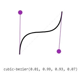
cubic-bezier( )
To customize the animation-timing-function as per your own requirement, also called as speed curve
Syntax
cubic-bezier(x1, y1, x2, y2)x : Float values between 0 to 1 (0 >= x <= 1), defines 'time'
y : Float values between 0 to 1 preferred, but can have negative values (y<0 or y>=0), defines 'progress'
- Note! Try not to go too high float values when setting y1, y2 until required
Below image is showing one of the speed curve, of value specified
Mouse over to pause animation
Default value is running
#box1:hover {
animation-play-state:paused;
}
#box1 {
animation-name:animation4;
animation-duration:2s;
animation-iteration-count:infinite;
background-color: #ef5195;
width:170px;
height: 80px;
}
<!DOCTYPE html>
<html>
<head>
<title>Full CSS Code</title>
<style>
@keyframes animation4 {
0% {transform: rotateX(0deg);background-color: #ffdd52;}
50% {transform: rotateX(180deg);background-color: #E57373;}
100% {transform: rotateX(0deg);background-color: #ffdd52;}
}
#box1:hover{
animation-play-state:paused;
}
#box1 {
animation-name:animation4;
animation-duration:2s;
animation-iteration-count:infinite;
background-color: #ef5195;
width:170px;
height: 80px;
}
</style>
</head>
<body>
<div id="box1" style="text-align:center;margin:auto;">Mouse over<br/>to pause!</div>
</body>
</html>Default value is none, delay used 5s
animation-fill-mode: |
@keyframes animation {
0% {left: -20px;}
100% {left: 100px;}
}
#box2 {
animation-name:animation;
animation-duration:2s;
animation-delay: 5s;
animation-fill-mode:none;
position: relative;
background-color: #ef5195;
width:170px;
height: 80px;
}
<!DOCTYPE html>
<html>
<head>
<title>Full CSS Code</title>
<style>
@keyframes animation {
0% {left: -20px;}
100% {left: 100px;}
}
#box2 {
animation-name:animation;
animation-duration:2s;
animation-delay: 5s;
animation-fill-mode:none;
position: relative;
background-color: #ef5195;
width:170px;
height: 80px;
}
</style>
</head>
<body>
<div id="box2" style="text-align:center;">Checkout animation!</div>
</body>
</html>Checkout
Animation!
Minimum required values are name & duration
#box3 {
/*animation:name duration time-function delay iteration-count direction fill-mode;*/
animation:animation5 2s linear 0s infinite alternate none;
background-color: #e95f73;
width:170px;
height: 80px;
}
<!DOCTYPE html>
<html>
<head>
<title>Full CSS Code</title>
<style>
@keyframes animation5 {
0% {transform: rotateX(0deg);}
50% {transform: rotateX(180deg);}
100% {transform: rotateX(0deg);}
}
#box3 {
/*animation:name duration time-function delay iteration-count direction fill-mode;*/
animation:animation5 2s linear 0s infinite alternate none;
background-color: #e95f73;
width:170px;
height: 80px;
}
</style>
</head>
<body>
<div id="box3" style="text-align:center;margin:auto;">Mouse over<br/> me!</div>
</body>
</html>- label_outlineMultiple animation
/*animation:animation1,animation2,.....,animationN;*/ animation:animation1 2s linear 0s infinite alternate,animation2 2s linear 0s infinite reverse;


 So,
So,