


CSS3 Gradient
Used to show smooth transitions between two or more specified colors
- Gradients are being declared inside
background:Property, specificallybackground-image:Property
- turned_in_notGradients types
- Linear gradient
- Radial gradient
- Conic gradient
Linear gradient
- Linear gradient can be declared using direction or angle
Full Syntax
linear-gradient(direction|angle, color1, color2, ...., colorN);direction : to left | to right | to top | to bottom | to top left | to top right | to bottom left | to bottom right
angle : In_degree
color : Only_Color | Color startDistance | Color startDistance endDistance
Top to Bottom Gradient
(Default)
linear-gradient(red,green,yellow);linear-gradient(#f68f8f, #f8f887);linear-gradient(yellow,teal,pink);linear-gradient(lightgreen,teal,lightpink,yellow,red);div {
/*background: linear-gradient(color1,color2,...colorN);*/
background: linear-gradient(#f68f8f, #f8f887);
height:200px;
}<!DOCTYPE html>
<html>
<head>
<title>Full CSS Code</title>
<style>
div {
/*background: linear-gradient(color1,color2,...colorN);*/
background: linear-gradient(#f68f8f, #f8f887);
height:200px;
}
</style>
</head>
<body>
<div>
<h5 style="text-align: center;">Top to Bottom Gradient</h5>
</div>
</body>
</html>Left to Right Gradient
linear-gradient(to left,#f68f8f, lightgreen);linear-gradient(to right,#f68f8f, lightgreen);linear-gradient(to top,#f68f8f, lightgreen);linear-gradient(to bottom,#f68f8f,lightgreen);div {
/*background: linear-gradient(direction,color1,color2,...colorN);*/
background: linear-gradient(to right,#f68f8f,lightgreen);
height:200px;
}<!DOCTYPE html>
<html>
<head>
<title>Full CSS Code</title>
<style>
div {
/*background: linear-gradient(direction,color1,color2,...colorN);*/
background: linear-gradient(to right,#f68f8f,lightgreen);
height:200px;
}
</style>
</head>
<body>
<div>
<h5 style="text-align: center;">Left to Right Gradient</h5>
</div>
</body>
</html>Digonal Gradient
linear-gradient(to bottom left,#f68f8f,lightgreen);linear-gradient(to bottom right,#f68f8f,lightgreen);linear-gradient(to top right,#f68f8f,lightgreen);linear-gradient(to top left,#f68f8f,lightgreen);div {
/*background: linear-gradient(direction,color1,color2,...colorN);*/
background: linear-gradient(to bottom right,#f68f8f,lightgreen);
height:200px;
}<!DOCTYPE html>
<html>
<head>
<title>Full CSS Code</title>
<style>
div {
/*background: linear-gradient(direction,color1,color2,...colorN);*/
background: linear-gradient(to bottom right,#f68f8f,lightgreen);
height:200px;
}
</style>
</head>
<body>
<div>
<h5 style="text-align: center;">Digonal Gradient</h5>
</div>
</body>
</html>Linear Angluar Gradient
div {
/*background: linear-gradient(angle,color1,color2,...colorN);*/
background: linear-gradient(-30deg,#f68f8f,lightgreen);
height:200px;
}<!DOCTYPE html>
<html>
<head>
<title>Full CSS Code</title>
<style>
div {
/*background: linear-gradient(angle,color1,color2,...colorN);*/
background: linear-gradient(-30deg,#f68f8f,lightgreen);
height:200px;
}
</style>
</head>
<body>
<div>
<h5 style="text-align: center;">Linear Angluar Gradient</h5>
</div>
</body>
</html>Repeating Linear Gradient
repeating-linear-gradient(#f68f8f 20%,lightgreen 50%);repeating-linear-gradient(to left,#f68f8f 20%, lightgreen 50%);repeating-linear-gradient(-60deg,#f68f8f 20%,lightblue 50%);div {
/*background: repeating-linear-gradient(angle or direction or Nothing,color1,color2,...colorN);*/
background: repeating-linear-gradient(-60deg,#f68f8f 20%,lightblue 50%);
height:200px;
}<!DOCTYPE html>
<html>
<head>
<title>Full CSS Code</title>
<style>
div {
/*background: repeating-linear-gradient(angle or direction or Nothing,color1,color2,...colorN);*/
background: repeating-linear-gradient(-60deg,#f68f8f 20%,lightblue 50%);
height:200px;
}
</style>
</head>
<body>
<div>
<h5 style="text-align: center;">Repeating Linear Gradient</h5>
</div>
</body>
</html>Radial gradient
- Radial gradient can be declared using shape circle or ellipse(Default)
Full Syntax
radial-gradient(shape size at x-position y-position, color1, color2, ...., colorN);shape : circle | ellipse
size : farthest-corner | closest-corner | farthest-side | closest-side
x-position : left | center | right | % | In_Units
y-position : top | center | bottom | % | In_Units
color : Only_Color | Color startDistance | Color startDistance endDistance
Where xy-position is the center point of circle or ellipse
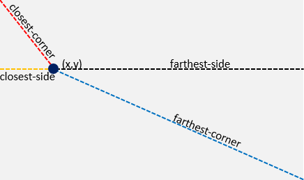
At specific point (x,y) the sizes are shown above &
size will be used to decide the radius of circle or ellipse
Radial Gradient
(Default)
radial-gradient(red, teal, yellow);radial-gradient(#f68f8f, #f8f887);radial-gradient(pink 20%,yellow 40%,teal 70%);radial-gradient(lightgreen,teal,yellow,red);div {
/*background: radial-gradient(color1,color2,...colorN);*/
background: radial-gradient(#f68f8f, #f8f887);
height:200px;
}<!DOCTYPE html>
<html>
<head>
<title>Full CSS Code</title>
<style>
div {
/*background: radial-gradient(color1,color2,...colorN);*/
background: radial-gradient(#f68f8f, #f8f887);
height:200px;
}
</style>
</head>
<body>
<div>
<h5 style="text-align: center;">Radial Gradient (Default)</h5>
</div>
</body>
</html>Radial Gradient
radial-gradient(circle,red, lightgreen,yellow);radial-gradient(circle,#f68f8f, #f8f887);radial-gradient(circle,lightgreen,teal,yellow,red);radial-gradient(circle,pink 20%,yellow 40%,teal 70%);radial-gradient(ellipse,lightgreen,teal,yellow,red);radial-gradient(circle at 50px 60px,teal,yellow,red);radial-gradient(circle closest-corner at 50px 60px,teal,yellow,red);div {
/*background: radial-gradient(shape,color1,color2,...colorN);*/
background: radial-gradient(circle,#f68f8f, #f8f887);
height:200px;
}<!DOCTYPE html>
<html>
<head>
<title>Full CSS Code</title>
<style>
div {
/*background: radial-gradient(shape,color1,color2,...colorN);*/
background: radial-gradient(circle,#f68f8f, #f8f887);
height:200px;
}
</style>
</head>
<body>
<div>
<h5 style="text-align: center;">Radial Gradient (Default)</h5>
</div>
</body>
</html>Repeating Radial Gradient
repeating-radial-gradient(#f68f8f 20%,lightgreen 50%);repeating-radial-gradient(circle,#f68f8f 20%, lightgreen 50%);repeating-radial-gradient(ellipse,#f68f8f 20%,lightblue 50%);div {
/*background: repeating-radial-gradient(shape size at y-position x-position or Nothing,color1,color2,...colorN);*/
background: repeating-radial-gradient(#f68f8f 20%,lightgreen 50%);
height:200px;
}<!DOCTYPE html>
<html>
<head>
<title>Full CSS Code</title>
<style>
div {
/*background: repeating-radial-gradient(shape or Nothing,color1,color2,...colorN);*/
background: repeating-radial-gradient(#f68f8f 20%,lightgreen 50%);
height:200px
}
</style>
</head>
<body>
<div>
<h5 style="text-align: center;">Repeating Radial Gradient</h5>
</div>
</body>
</html>Conical gradient
- To create gradient color transitions rotated around a center point within 360deg, like a pie-chart
Full Syntax
conic-gradient(from angle at x-position y-position, color1, color2, ...., colorN);angle : deg | turn | rad | %
x-position : left | center | right | % | In_Units
y-position : top | center | bottom | % | In_Units
color : Only_Color | Color startAngle | Color startAngle endAngle
Conical Gradient
conic-gradient(red, teal 0.5turn, yellow);conic-gradient(#f68f8f, #f8f887);conic-gradient(pink 20%,yellow 40%,teal 70%);conic-gradient(lightgreen,teal,yellow,red);conic-gradient(red 0.25turn, blue 0.25turn 0.5turn, red 0.5turn 0.75turn, blue 0.75turn);conic-gradient(from 60deg at 25% 25%, blue, red, yellow);div {
/*background: conic-gradient(color1,color2,...colorN);*/
background: conic-gradient(#f68f8f, #f8f887);
height:200px;
}<!DOCTYPE html>
<html>
<head>
<title>Full CSS Code</title>
<style>
div {
/*background: conic-gradient(color1,color2,...colorN);*/
background: conic-gradient(#f68f8f, #f8f887);
height:200px;
}
</style>
</head>
<body>
<div>
<h5 style="text-align: center;">Conical Gradient (Default)</h5>
</div>
</body>
</html>Repeating Conical Gradient
repeating-conic-gradient(#f68f8f 20%,lightgreen 50%);repeating-conic-gradient(#f68f8f 20deg, lightblue 50deg);repeating-conic-gradient(red 0 9deg, blue 9deg 18deg);div {
/*background: repeating-conic-gradient(from angle at y-position x-position or Nothing,color1,color2,...colorN);*/
background: repeating-conic-gradient(#f68f8f 20%,lightgreen 50%);
height:200px;
}<!DOCTYPE html>
<html>
<head>
<title>Full CSS Code</title>
<style>
div {
/*background: repeating-conic-gradient(color1,color2,...colorN);*/
background: repeating-conic-gradient(#f68f8f 20%,lightgreen 50%);
height:200px
}
</style>
</head>
<body>
<div>
<h5 style="text-align: center;">Repeating Conical Gradient</h5>
</div>
</body>
</html>


 So,
So,