

CSS3 Filter
Next ❯Clip Path
Used to change the visual effect of an element
- Methods are used in
filter:Property
- turned_in_notFilter Methods
blur()brightness()contrast()grayscale()hue-rotate()
invert()opacity()saturate()sepia()drop-shadow()url()
- Alert: Limited values are used below, you can use more big values as per your need

At default:0px, See original image
blur(2px);
img {
filter:blur(2px);
}blursubject
blurclose
<!DOCTYPE html>
<html>
<head>
<title>Full CSS Code</title>
<style>
img {
filter:blur(2px);
}
</style>
</head>
<body>
<img src="image.png" alt="image">
</body>
</html>At default:100%, See original image
brightness(2%);
img {
filter:brightness(2%);
}brightnesssubject
brightnessclose
<!DOCTYPE html>
<html>
<head>
<title>Full CSS Code</title>
<style>
img {
filter:brightness(2%);
}
</style>
</head>
<body>
<img src="image.png" alt="image">
</body>
</html>At default:100%, See original image
contrast(2%);
img {
filter:contrast(2%);
}
contrastsubject
contrastclose
<!DOCTYPE html>
<html>
<head>
<title>Full CSS Code</title>
<style>
img {
filter:contrast(2%);
}
</style>
</head>
<body>
<img src="image.png" alt="image">
</body>
</html>At default:0%, See original image
grayscale(50%);
img {
filter:grayscale(50%);
}
grayscalesubject
grayscaleclose
<!DOCTYPE html>
<html>
<head>
<title>Full CSS Code</title>
<style>
img {
filter:grayscale(50%);
}
</style>
</head>
<body>
<img src="image.png" alt="image">
</body>
</html>At default:0deg, See original image
hue-rotate(10deg);
img {
filter:hue-rotate(10deg);
}
hue-rotatesubject
hue-rotateclose
<!DOCTYPE html>
<html>
<head>
<title>Full CSS Code</title>
<style>
img {
filter:hue-rotate(10deg);
}
</style>
</head>
<body>
<img src="image.png" alt="image">
</body>
</html>At default:0%, See original image
invert(70%);
img {
filter:invert(70%);
}
invertsubject
invertclose
<!DOCTYPE html>
<html>
<head>
<title>Full CSS Code</title>
<style>
img {
filter:invert(70%);
}
</style>
</head>
<body>
<img src="image.png" alt="image">
</body>
</html>At default:100%, See original image
opacity(50%);
img {
filter:opacity(50%);
}
opacitysubject
opacityclose
<!DOCTYPE html>
<html>
<head>
<title>Full CSS Code</title>
<style>
img {
filter:opacity(50%);
}
</style>
</head>
<body>
<img src="image.png" alt="image">
</body>
</html>At default:100%, See original image
saturate(50%);
img {
filter:saturate(50%);
}
saturatesubject
saturateclose
<!DOCTYPE html>
<html>
<head>
<title>Full CSS Code</title>
<style>
img {
filter:saturate(50%);
}
</style>
</head>
<body>
<img src="image.png" alt="image">
</body>
</html>At default:0%, See original image
sepia(50%);
img {
filter:sepia(50%);
}
sepiasubject
sepiaclose
<!DOCTYPE html>
<html>
<head>
<title>Full CSS Code</title>
<style>
img {
filter:sepia(50%);
}
</style>
</head>
<body>
<img src="image.png" alt="image">
</body>
</html>X-axis
Y-axis
blur
color:
drop-shadow(1px 1px 10px red);
img {
/*filter:drop-shadow(x-axis y-axis blur color);*/
filter:drop-shadow(1px 1px 10px black);
}
drop-shadowsubject
drop-shadowclose
<!DOCTYPE html>
<html>
<head>
<title>Full CSS Code</title>
<style>
img {
/*filter:drop-shadow(x-axis y-axis blur color);*/
filter:drop-shadow(1px 1px 10px black);
}
</style>
</head>
<body>
<img src="image.png" alt="image">
</body>
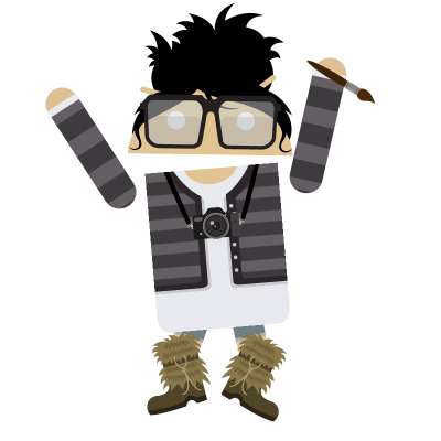
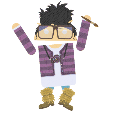
</html>Here, above image is using sepia( ) & brightness( ) filter methods
img {
/*filter:method1 method2 ....;*/
filter:sepia(50%) brightness(150%);
}
Multiple Filterssubject
Multiple Filtersclose
<!DOCTYPE html>
<html>
<head>
<title>Full CSS Code</title>
<style>
img {
/*filter:method1 method2 ....;*/
filter:sepia(50%) brightness(150%);
}
</style>
</head>
<body>
<img src="image.png" alt="image">
</body>
</html>Mainly used in SVG
/*filter: url(#svg_filter_element_id);*/urlsubject
urlclose
<!DOCTYPE html>
<html>
<head>
<title>Full CSS Code</title>
</head>
<body>
<svg height="160" width="280">
<filter id="abc">
<feGaussianBlur in="SourceGraphic" stdDeviation="8"/>
<feBlend in="SourceGraphic" mode="multiply"/>
</filter>
<circle cx="80" cy="80" r="50" fill="teal"/>
<circle cx="200" cy="80" r="50" fill="teal" filter="url(#abc)"/>
</svg>
</body>
</html>❮ Prev CSS3 Animation
Next ❯Clip Path


 So,
So,