


Form Elements
Next ❯Input Types
Form Elements are used to create forms inside your web page
- Tags are:
<button>, <fieldset>, <form>, <label>, <legend>, <input>, <option>, <optgroup>, <select>, <textarea>
- turned_in_notAll Form Elements Used
<!DOCTYPE html> <html> <head><title>All Form Elements Used</title></head> <body> <form> <fieldset> <legend>All Elements Used</legend> Input: <input type="text"> <label>label select</label>< Select:<select name="code"> <option value="html">HTML</option> <option value="css">CSS</option> <option value="javascript">JavaScript</option> </select><br> <label>label Optgroups</label> Select multiple: <select> <optgroup label="mobile"> <option value="1">Option 1</option> <option value="2">Option 2</option> </optgroup> <optgroup label="color"> <option value="3">Option 3</option> <option value="4">Option 4</option> </optgroup> </select><br> TextArea:<textarea name="story" rows="5" cols="20">The Is the TextArea</textarea><br> <button type="button" onclick="alert('Hello, I am a button')">Click Me!</button> </fieldset> </form> </body> </html>You get OUTPUT:
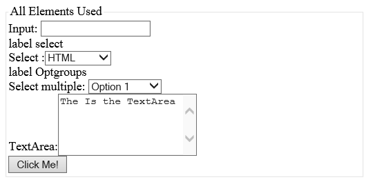
- Alert! You will get above output, because of not using css So, don't get confuse
OUTPUT:
<fieldset>element is used to group related data in a form.<legend>element defines a caption or Heading for the<fieldset>element.
Input Element
- We have Single Input element but of many Types
- Syntax:
<input type="Input_Type">
- trending_downInput Types
Input Type Description
Input Type Description textSingle Line text field passwordSingle line Password Field (Mainly used for sensitive information) submitUsed to submit your form automatically by just clicking on it resetTo rest the Form Fields radioUsed when one option is required out of many options checkboxUsed when more than one option is required to be selected buttonCan create button from this option also hiddenUsed when any fixed data has to be send on the server FileUsed When to upload any file to the server imageTo create image type button - All the Input Types are discuss in next chapter
- trending_downHTML5 Input TypesLATEST
Input Type Description
Input Type Description colorInput Color Field dateA Date (Format: Year, Month, Day) datetime-localA date and time with no time zone information emailTo accept only email value monthDate contains Year & Month numberTo accept only numerical value rangeTo accept value from a range of numbers searchIt is used for search fields telTo accept only telephone number timeTime contains (Hour, Minute, Seconds, Fractional Seconds) urlTo accept only URL value weekTo accept only date, contains Year & week - You can Learn this Types in HTML5 Tutorial
*Now Mostly Websites are also using HTML5 Input Type
TextArea Element
It Defines a multi-line input field
- Tag used:
<textarea>
- turned_in_notSample Example
<!DOCTYPE html> <html> <head><title>TextArea Input Example</title></head> <body> <form> Description: <br> <textarea rows="5" cols="20" name="description"> Enter your description here... </textarea> </form> </body> </html>OUTPUT:
Description:- rows - Specifies the visible height of text area
cols - Specifies the visible width of text area
- rows - Specifies the visible height of text area
Browsers Supports
 Safari Safari |  Microsoft Edge Microsoft Edge |  Mozilla Firefox Mozilla Firefox |  Chrome Chrome |  Opera Mini Opera Mini |
Click on the above icon to see the name of the browser !
- Tips! Always try to use latest version of browser
Select Element
It provides a drop-down list
- Tag used:
<select>, <option>, <optgroup>
- turned_in_notSample Example
<!DOCTYPE html> <html> <head><title>Select Element Example</title></head> <body> <form> <label>label select</label> Select:<select name="code"><br> <option value="html">HTML</option> <option value="css">CSS</option> <option value="javascript">JavaScript</option> </select><br> <label>label Optgroups</label><br> Select Mobile: <select> <optgroup label="Apple"> <option value="1">iphone 6</option> <option value="2" selected>iphone 7</option> </optgroup> <optgroup label="Orange"> <option value="3">Orange 3</option> <option value="4">Orange 5</option> </optgroup> </select> </form> </body> </html>OUTPUT:
Select:
Select Mobile:<option>tag defines an option that can be selected- By default, the first item in the drop-down list is selected
- To define a pre-selected option, add "selected" keyword inside the
<option>tag <optgroup>tag is used to group related types of options in single drop-down list- To select multiple options use "multiple" keyword inside the
<select>tag, and use 'CTRL' key while selecting, to select more options
Browsers Supports
| Safari | Microsoft Edge | Mozilla Firefox | Chrome | Opera Mini |
Click on the above icon to see the name of the browser !
- Tips! Always try to use latest version of browser
Button Element
It used to create a clickable button
- Tag used:
<button>
- turned_in_notSample Example
<!DOCTYPE html> <html> <head><title>Button Example</title></head> <body> <button onclick="alert('Hello World!')">Click Me!</button> </body> </html>OUTPUT:
<button>tag can be used out of<form>tag also
Browsers Supports
| Safari | Microsoft Edge | Mozilla Firefox | Chrome | Opera Mini |
Click on the above icon to see the name of the browser !
- Tips! Always try to use latest version of browser
Fieldset Element
- Tag used:
<fieldset>, <legend>
- turned_in_notSample Example
OUTPUT:<!DOCTYPE html> <html> <head><title>Fieldset Example</title></head> <body> <form> <fieldset> <legend>Name</legend> First Name: <input type="text"><br> Last Name: <input type="text"><br> </fieldset> </form> </body> </html><fieldset>element is used to group related data in a form.<legend>element defines a caption or Heading for the<fieldset>element.
Browsers Supports
| Safari | Microsoft Edge | Mozilla Firefox | Chrome | Opera Mini |
Click on the above icon to see the name of the browser !
- Tips! Always try to use latest version of browser
❮ Prev Form Action
Next ❯Input Types


 So,
So,